


Custom Envelopes Designed to Make Every Message More Memorable
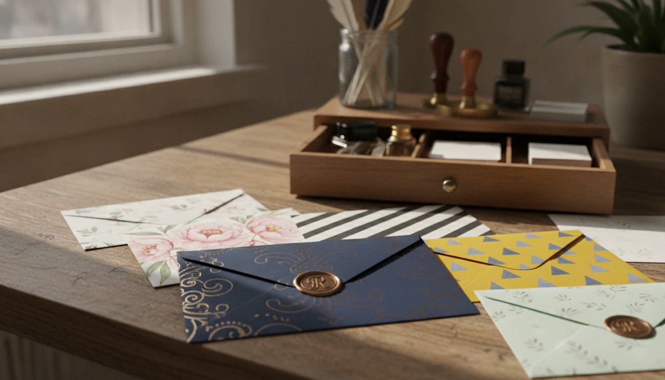
Custom envelopes make regular mail special. They are key for businesses, nonprofits, event planners, and more. The envelope's look can grab attention before anyone reads it.
This guide will show you how to make envelopes that catch the eye. You'll learn about size, materials, colors, and typography. Adding personal touches can make your envelopes stand out.
Personalized envelopes are great for many uses. They work for business letters, fundraising, and even wedding invites. Choosing the right printing and reviewing your design carefully can make your mail unforgettable. These tips help your messages shine in a busy mailbox.
Custom Envelopes: How They Create a Stronger First Impression
An envelope speaks before the message inside it. People notice its color, layout, paper, and graphics first. A clean design shows care and professionalism. Distinctive details can spark curiosity and invite the recipient to open the mail.
Custom envelopes can make routine mailings stand out. Branded mailers create a visual connection between the envelope and the enclosed letter. This makes the mailing feel planned and special.
Turn ordinary mail into a memorable brand experience
Strong envelope branding starts with the company’s visual identity. Using brand colors helps people recognize a sender. This makes the brand easier to remember after several mailings.
A logo should be clear and easy to identify. It must support the layout without covering important details. Proper spacing ensures every element is readable.
Typography shapes the tone of the envelope. A law firm or financial institution may use restrained type. An arts group or retailer may use expressive lettering. Each font must be legible at the printed size.
Purposeful imagery can strengthen the message. Illustrations or photography may highlight a campaign theme. Too many images can create clutter, so each image must have a clear purpose.
Choose envelope designs that match your message and audience
Design intensity should match the occasion and the recipient. A formal business notice needs a different look than a birthday invitation. The envelope should set accurate expectations for the content inside.
-
Professional: Restrained colors, clear type, balanced spacing, and minimal graphics suit healthcare providers, corporate offices, law firms, and financial institutions.
-
Creative: Bold color combinations, illustrations, unusual layouts, and expressive type can support agencies, artists, retailers, and entertainment brands.
-
Elegant: Premium paper, subtle colors, refined type, foil details, and understated monograms work well for weddings, luxury services, and formal invitations.
-
Seasonal: Holiday colors, decorative patterns, themed art, and event messages add energy to greeting cards, celebrations, and annual campaigns.
-
Promotional: High-contrast elements, campaign headlines, offer details, and attention-grabbing graphics can strengthen direct-mail envelopes used for customer outreach.
Audience demographics, industry standards, and brand personality should guide the design direction. A bold treatment may suit a creative campaign but feel out of place on sensitive documents. Professional envelopes need a calm, trustworthy appearance when the message calls for discretion.
Creative envelope design should remain inviting and truthful. A headline or promotional graphic must relate to the enclosed content. When the outside message matches what recipients find inside, the mailing builds trust and supports a stronger response.
How to Design Custom Envelopes for Branding and Engagement
Start by thinking about what's inside and how you'll send it. Consider the size of the inserts, how thick they are, how many you have, and how you'll mail them. These details help pick the right envelope size and avoid costly design changes.
Select the right size, format, and envelope style
Choosing the right envelope size is key. It should keep your documents safe without looking too crowded. The envelope should fit snugly to protect corners and open easily.
There are different envelope formats for different needs. Business envelopes are great for letters and official documents. Catalog envelopes are perfect for brochures and marketing materials. Invitation envelopes are ideal for wedding invitations and formal notes.
For a unique campaign, consider square or unusual shapes. But remember, they might need special handling and extra postage. Always check the latest USPS rules before choosing an unusual shape.
Think about how you'll open the envelope. Peel-and-seal and self-seal closures are quick and easy. Traditional flaps add a touch of formality. Booklet construction is best for larger documents. Specialty openings can add drama, but might require more effort to assemble.
A window can show the recipient's address and save time on labeling. Make sure the window fits the document and meets mailing rules. Test the folded piece before printing to ensure the address is clear.
Use colors, typography, and graphics strategically
Every element should support your brand. Match the envelope with the colors, fonts, and logo used in the enclosed materials. This creates a cohesive look from start to finish.
Stick to a focused color scheme. Brand colors help recognition. One accent color can draw attention to important details.
Ensure text is easy to read on colored stock. Use graphics wisely. Each element should have its own role in the design. The logo, message, and address should stand out.
Graphics should have a purpose. A simple image or pattern can enhance the theme. Don't forget the importance of empty space for clarity.
Provide logos as high-quality vector files or clear images. Low-resolution artwork can look blurry. Always check color proofs, especially on dark paper or specialty ink.
Add personalized details that encourage recipients to open the mail
Personalized mail feels more special when it's accurate. Use names, tailored messages, and campaign identifiers to connect with the recipient. Tailor these details to fit the relationship with the reader.
Handwritten-style type adds warmth to invitations and thank-you notes. Use it for short phrases or names, not for long texts. A clear font is essential for important information.
Custom invitation envelopes can include unique features like seals or stickers. These add a special touch. But remember, they might increase production time and costs.
Custom interior printing can reveal a pattern or hidden message. It's great when the recipient sees the inside flap. This adds a layer of excitement to the mailing.
Personalization must be precise. Avoid mistakes in names or data. Design the envelope as part of the overall communication. The outside should intrigue, while the inside delivers.
|
Envelope choice |
Best use |
Design point |
Practical check |
|
Business envelope |
Letters, invoices, statements, and contracts |
Clear logo placement with strong address contrast |
Confirm the fold and window position |
|
Catalog envelope |
Brochures, reports, and several inserts |
Use sturdy stock and a simple visual hierarchy |
Measure the full stack before selecting the size |
|
Invitation envelope |
Weddings, events, announcements, and formal notes |
Add refined typography, liners, or seals |
Allow room for layered inserts |
|
Greeting-card envelope |
Folded cards and personal messages |
Match the outer design with the card artwork |
Check that corners remain protected |
|
Square or specialty format |
Distinctive promotions and creative campaigns |
Use shape as a controlled visual feature |
Review postage, sorting, and labeling rules |
Materials, Printing Options, and Practical Tips for Custom Envelopes
The choice of stock and print method greatly affects how mail looks and feels. The material should match the message, budget, and protection needs. A well-designed envelope should look good without causing sorting or delivery issues.
Choose durable and attractive envelope materials
Standard paper is good for invoices, letters, and large mailings. It's familiar and cost-effective. Heavier paper makes the envelope feel stronger and adds protection.
Recycled paper envelopes show a commitment to sustainability. However, the color and texture may affect ink appearance. Designers should test contrast before printing.
Textured paper adds a touch to invitations and premium mail. It softens details but is not best for sharp graphics. Smooth stock is better for detailed work.
Colored paper can make a big impact without needing a lot of print. Ink choice is crucial for readability on the paper color. Luxury materials can increase costs but enhance value.
Choosing the right material considers the entire mailing process. The envelope must withstand inserting, sealing, sorting, and delivery. It should also protect its contents well.
Select printing techniques and finishing touches
Digital printing is great for short runs and quick production. It's good for personalized campaigns. Offset printing is better for large quantities with consistent colors.
Premium printing can include metallic or fluorescent inks. These effects highlight logos or messages. Foil-stamped envelopes have reflective accents for a refined look.
Embossed envelopes feature raised details like logos or patterns. Debossing creates a recessed effect. Both add texture but may increase costs.
Custom liners add color or patterns inside the envelope. They're perfect for invitations and luxury mailings. Finishing touches should enhance the message, not compete with it.
Prepare artwork and proof designs before ordering
Artwork must follow the printer's rules for bleed and safe margins. Backgrounds and graphics should extend to the edge. Important text and logos should avoid folds and trim lines.
Make sure to leave space for postage and addresses. Use high-resolution images and vector logos. Fonts should be embedded or in the printer's format.
Check color modes and how the paper affects color balance. Follow postal rules for size, shape, and surface treatment. These affect postage and handling.
Proofing is key for checking margins, logo placement, and color balance. Review the proof at actual size, not just on a screen. Small details and special finishes can look different in production.
Variable data needs careful review. A physical sample can reveal issues with spacing and data. Order a sample for unique paper or finishes.
Before finalizing, check the order details. A thorough review ensures the mailing looks good and is ready for delivery.
Conclusion
Custom envelopes can make a big difference in how people see your mail. They help create a strong brand image and make your messages stand out. This makes both personal and business mail more memorable and polished.
When designing your envelopes, think about the message and who it's for. Different types of mail need different looks. For example, a business letter might be formal, while a greeting card can be more playful.
Choosing the right envelope is important too. Pick one that's the right size and shape, and has a good finish. You can also add special touches like foil or embossing to make your envelopes more unique.
Before you order, make sure to check all the details. Look at bleed, margins, and color accuracy. A printed proof can help catch any mistakes. This ensures your envelopes look great and make a lasting impression.

 English
 Arabic
 French
 Spanish
 Portuguese
 Deutsch
 Dutch
Dutch
 Italiano
 Russian
 Romaian
 Portuguese (Brazil)
 Greek
Greek