


How Does BAPE Use Graphics to Tell a Fashion Story?
Introduction
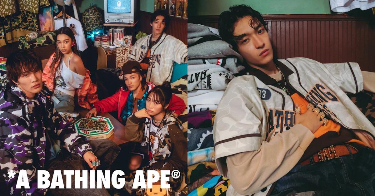
Every streetwear label has a signature, but few brands have built an entire identity on artwork the way BAPE has. Since its early days in Tokyo, the label has treated garments as canvases rather than blank basics. A hoodie is never just a hoodie, and a tee is never just cotton and thread. Instead, each piece carries a small piece of narrative, drawn in bold shapes, loud colors, and instantly recognizable characters that fans learn to read like a visual dialect.
The Camo Print That Became a Signature
BAPE's camouflage pattern is arguably the most imitated print in modern streetwear. Unlike traditional military camo, the brand reworked the shapes into something playful and graphic, swapping muted greens for punchy color combinations. This small shift changed everything. The print stopped looking like gear and started looking like art. Wearing it became a statement of taste rather than utility, which is exactly the kind of storytelling shift that separates a fashion label from an outdoor supplier.
The Ape Head Logo as a Storytelling Tool
The ape head isn't simply a logo stitched onto fabric; it functions as a mascot with personality. Depending on placement, size, and color, the same symbol can feel aggressive, cartoonish, or luxurious. Designers stretch it across a chest panel, shrink it into a subtle corner mark, or turn it into an oversized graphic that dominates the garment. That flexibility lets one consistent icon tell different moods across different drops, keeping the brand recognizable without ever feeling repetitive or static.
Bold Colors and Bright Contrasts
Color choice does a lot of narrative work for BAPE. Instead of leaning on muted streetwear palettes, the brand frequently pairs neon greens, deep purples, and sharp yellows against black or white bases. This contrast isn't accidental. It mimics the energy of comic book panels and arcade graphics, giving each release a sense of motion and excitement even when the garment is sitting flat on a shelf. Bright color becomes shorthand for confidence and youthful rebellion.
The Iconic BAPE Tee Shirt Canvas
Few pieces show off this graphic philosophy better than the classic bape tee shirt. The chest and back become storytelling real estate, often layered with camo panels, ape silhouettes, or collaboration artwork stacked together in one composition. Where many brands print a single logo and stop, BAPE treats the shirt as a full page, using negative space, layering, and scale to build a mini scene. That density is part of why the tee still feels collectible decades later.
Shark Hoodies and the Veste Requin Legacy
The shark hoodie, often searched internationally as veste requin, may be the clearest example of graphics driving emotion. The zip-up mouth, sharp teeth, and wide eyes turn a simple hooded jacket into a character. Zipping it fully closed transforms the wearer's face into part of the design, blurring the line between clothing and costume. That interactive element is rare in fashion, and it explains why the piece has remained a cultural touchstone since its release.
Pop Culture and Street Art Influence
BAPE's graphic sensibility borrows heavily from graffiti, manga, and early 2000s hip-hop visuals. Founder Nigo drew inspiration from Planet of the Apes, arcade culture, and Harajuku's experimental street scene, blending references most brands would keep separate. This mash-up approach gives every collection a lived-in, remix quality rather than a polished corporate feel. The clothing reads like a scrapbook of influences, which makes it feel personal and slightly rebellious rather than mass-produced.
Limited Editions and Collector Culture
Scarcity adds another layer to the visual storytelling. Limited runs and city-exclusive prints mean certain graphics only exist for a short window, tying imagery to memory and timing. A shirt worn in 2005 tells a different story than the same silhouette reissued today, because the print itself becomes a timestamp. This turns garments into artifacts, encouraging fans to treat their closets like small archives of moments rather than just wardrobes.
Collaborations That Expand the Narrative
Partnerships with artists, musicians, and other labels let BAPE fold outside stories into its own visual world. A collaborative graphic often blends the partner's identity with BAPE's camo or ape motifs, creating a hybrid image that couldn't exist anywhere else. These crossovers act like guest chapters in an ongoing story, introducing new audiences to the brand's visual grammar while giving longtime fans fresh variations on symbols they already recognize and trust.
Consistency Across Collections
Despite constant experimentation, certain visual anchors never disappear entirely. The camo, the ape head, and the shark motif resurface season after season in new colorways and formats. This consistency matters because it gives casual observers something familiar to hold onto, even as the brand pushes into new silhouettes or materials. Recognizability becomes part of the storytelling itself, letting each new drop feel like a continuation rather than a total reinvention.
Graphics as Identity, Not Just Decoration
For BAPE, artwork isn't an afterthought added once a garment's shape is finalized. Graphics often drive the design decisions from the very start, influencing cut, paneling, and even fabric weight. A shark hood needs specific stitching to hold its shape; an oversized back print needs room to breathe. This graphics-first mindset is part of what separates the brand from labels that simply stamp a logo onto an existing basic template.
Why Fans Connect With BAPE's Visual Story
People don't just buy BAPE for comfort or fit; they buy into a visual world they recognize instantly, whether it's a bold bape tee shirt or the memorable veste requin silhouette. Wearing the brand signals membership in a specific aesthetic history that spans street art, gaming, and early internet hype culture. That emotional recognition is harder to copy than any single print, which is exactly why so many imitators struggle to capture the same feeling.
Conclusion: A Brand Built on Bold Imagery
BAPE's real innovation was never a single print or logo, but the decision to treat clothing as a storytelling surface. Camo, sharks, and ape heads work together as a consistent visual vocabulary that fans can read across decades of releases. In a market full of minimal logos, that commitment to loud, layered graphic design remains one of the clearest reasons the brand still feels distinct today.

 English
 Arabic
 French
 Spanish
 Portuguese
 Deutsch
 Turkish
 Dutch
Dutch
 Italiano
 Russian
 Romaian
 Greek
Greek