A contact form gives website visitors a way to ask a question, request a quote, book a service, or share their details. Yet many people start filling out a form and leave before sending it. This can reduce the number of enquiries a website receives, even when the website gets regular visitors.
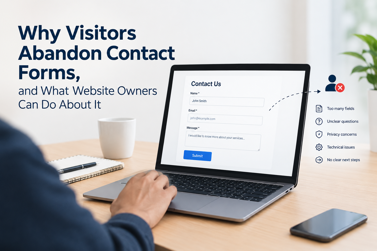
Form abandonment can happen for many reasons. A form may ask for too much information, contain unclear fields, take too long to complete, or create doubt about what happens after submission. Technical problems can also stop a visitor from completing the form.
Understanding these issues helps website owners find where visitors are dropping out and make useful changes.
What Is Contact Form Abandonment?
Contact form abandonment happens when a visitor begins filling out a contact form but leaves the page without submitting it.
For example, a visitor may enter their name and email address, start writing a message, and then close the page. They may also leave after seeing several required fields or when the form asks for information they do not want to provide.
This is different from a visitor who looks at a page but never opens the form. In abandonment, there is a clear sign that the person started the enquiry process.
Why Do Visitors Abandon Contact Forms?
There is no single reason behind every abandoned form. Different visitors may leave for different reasons. However, some issues appear often across websites.
1. The Form Asks for Too Much Information
Long forms can make visitors think twice before continuing.
A basic enquiry may only need a name, email address, and message. If the same form also asks for a phone number, company name, job title, address, postcode, company size, and several other details, the visitor may decide not to continue.
Website owners should ask whether each field is needed at the first stage of contact.
If a field is not needed to respond to the enquiry, removing it can reduce the amount of work required from the visitor.
2. Too Many Required Fields
Required fields can create another barrier.
A visitor may be ready to submit a form but find that several fields must be completed before submission. Some of these fields may not seem relevant to their question.
For example, someone asking about a service may not want to provide a company name or phone number. If those details are required, the person may leave rather than complete the form.
Required fields should have a clear reason behind them.
3. Unclear Questions
Visitors need to know what each field is asking for.
A label such as “Details” may not tell the visitor what information should be entered. A clearer label, such as “Tell us what you need help with”, gives more direction.
The same applies to dropdown menus, checkboxes, and other form elements. When a question is unclear, visitors may stop rather than guess.
4. The Form Looks Too Long
The number of fields is not the only issue. The way a form is displayed also matters.
A form with many fields placed one after another can look like a large task. Visitors may see the form and decide that completing it will take too much time.
Breaking information into logical sections can make the form easier to understand. For shorter forms, keeping the number of fields visible on the screen can also help visitors know what they need to complete.
5. Visitors Have Privacy Concerns
People may hesitate when a form asks for personal information.
A visitor may wonder why a website needs their phone number, address, or other details. They may also want to know how their information will be used after submission.
A short privacy statement near the form can answer some of these concerns. It should explain the purpose of collecting the information without adding unnecessary text.
6. The Website Does Not Explain What Happens Next
A visitor may not know what will happen after pressing the submit button.
Will someone reply by email? Will the company call them? How long should they expect to wait?
A short message near the form can provide useful information. For example, a website can explain that the enquiry will be reviewed and that a reply will be sent by email.
This gives the visitor a clearer idea of what follows the submission.
Mobile Users Can Face Extra Problems
Many people browse websites on smartphones. A contact form that works well on a desktop computer may be harder to complete on a small screen.
Small input boxes, difficult dropdown menus, poor spacing, or a submit button that is hard to tap can create problems.
Website owners should test forms on different screen sizes. The fields should fit the screen, the text should remain readable, and buttons should be large enough to tap without difficulty.
The keyboard type can also matter. An email field should bring up an email-friendly keyboard where supported, while a number field can use a number keypad.
These small details can affect whether someone finishes the form.
Technical Errors Can Stop Form Submissions
Not every abandoned form is caused by the visitor.
A form may have a technical problem that prevents submission. An error message may appear after the visitor has entered all their information. A required field may not work correctly. A form may also fail to send the information to the website owner.
These problems can be difficult to notice because the website may appear to work normally during a basic visit.
Website owners should test forms regularly. Testing should include entering information, submitting the form, checking the confirmation message, and making sure the enquiry reaches the correct email or system.
Slow Loading Can Affect Form Completion
A contact form is part of the overall website experience. If the page takes too long to load, some visitors may leave before they even start filling it out.
Large images, unnecessary scripts, poor hosting performance, and other technical issues can affect loading time.
Website owners should check the page on both desktop and mobile devices. They should also pay attention to pages that contain forms but receive little engagement after visitors arrive.
Error Messages Should Be Clear
Form errors are another common reason people stop.
Imagine a visitor fills in several fields and presses the submit button. The form then displays a message saying, “Invalid input.”
That message does not tell the visitor what needs to be fixed.
A useful error message should identify the field and explain the problem. For example, if an email address is missing a required part, the message should tell the visitor to enter a valid email address.
Clear error messages reduce guesswork and help visitors correct mistakes.
Make the Purpose of the Form Clear
Visitors should know why they are being asked to complete the form.
A heading such as “Contact Us” may be enough for a general enquiry page. However, a more specific heading can explain the purpose of the form.
For example:
Ask About Our Services
Request More Information
Send Us Your Enquiry
The text should match the action the visitor wants to take. This keeps the form connected to the reason they visited the page.
Track Where Visitors Leave
Website owners need data to understand form abandonment.
Tracking can show how many visitors open a form, begin entering information, and submit it. When possible, form analytics can also show which fields are linked with higher drop-off rates.
For example, if many visitors complete the first few fields but stop when asked for a phone number, that field deserves closer attention.
The data does not automatically explain why people leave, so it should be reviewed alongside user feedback, form testing, and technical checks.
Contact Form Abandonment Data Can Reveal Hidden Problems
A high number of abandoned forms can point to issues that are not obvious from a normal website visit. A visitor may spend several minutes reading a page, start the form, and then leave because one part of the process creates doubt or extra work.
Tools that monitor contact form abandonment can help website owners identify these missed enquiries and understand where visitors stop. For websites that depend on online enquiries, LeadXForm provides a contact form abandonment service that can help track abandoned submissions and give website owners more information about lost form activity.
Visit for more info: https://www.leadxforms.com/
Final Thoughts
Contact form abandonment can happen for many reasons. Long forms, unclear questions, privacy concerns, mobile problems, technical errors, and unclear next steps can all affect form completion.
Website owners can reduce these problems by reviewing the form from the visitor's point of view. Remove fields that are not needed, make questions clear, test the form on mobile devices, check error messages, and monitor where visitors leave.
Form abandonment data can also show patterns that are difficult to find through normal website analytics. When website owners combine this data with regular testing and visitor feedback, they can make better decisions about how their contact forms work.




 English
 Arabic
 French
 Spanish
 Deutsch
 Turkish
 Dutch
Dutch
 Italiano
 Russian
 Romaian
 Portuguese (Brazil)
 Greek
Greek