


Business Card Printing: Give Your Brand Something People Can Hold Onto
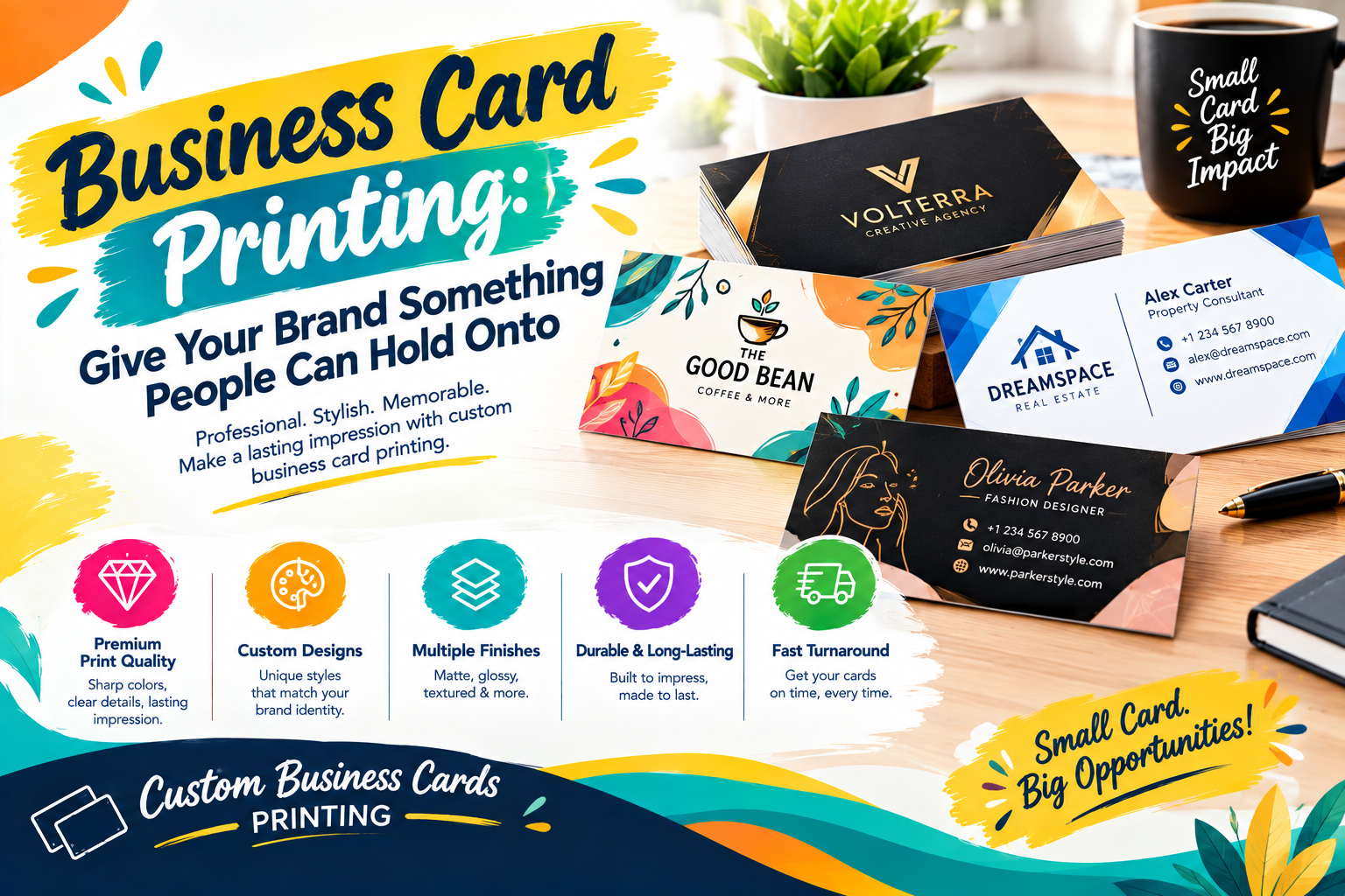
A business introduction usually lasts only a few moments. You say your name, explain what you do, exchange a few words, and the conversation moves on. But what if the person you met could take a small reminder of that conversation with them?
That is where a thoughtfully printed business card can make a difference.
Business Card Printing is no longer just about putting contact details on a small piece of card. The paper, colors, typography, finish, layout, and even the amount of empty space can all contribute to how a business is remembered.
A well-made card does not need to be loud or overloaded with effects. It simply needs to feel like it belongs to the brand behind it.
Start With the Impression, Not the Template
One of the easiest mistakes when creating a business card is opening a template and immediately trying to fill every section.
A better starting point is to think about the impression you want the recipient to get.
Should the card feel modern and straightforward? Warm and approachable? Established and formal? Creative and unexpected?
Once that direction is clear, design decisions become much easier. A restrained layout may suit one business perfectly, while another may need stronger colors or an unusual visual element.
The card should communicate personality before the recipient has read every word.
A Small Canvas Needs a Clear Visual Order
There is very little room on a business card, which makes visual hierarchy particularly important.
Your name should not compete with your phone number. A logo should not overpower the business name. A decorative background should not make essential information difficult to read.
Think of the design as a conversation. The eye should naturally move from the most important element to the next instead of jumping randomly around the card.
Sometimes this means removing something rather than adding another design feature.
A clean card with three carefully positioned elements can feel far more professional than one containing ten competing details.
Let Your Brand Decide the Color Palette
Color should have a reason for being there.
If your business already has established brand colors, bringing those shades into the card creates continuity. Someone who has seen your website or packaging should be able to recognize the same identity when they receive your card.
For a new business, the choice can begin with the personality of the brand. Deep tones may create a different mood from soft neutrals, while brighter combinations can give a more energetic impression.
The important part is not following whatever color happens to be popular. It is choosing a combination that makes sense for your business and remains readable when printed.
Typography Can Make or Break the Card
People often spend considerable time choosing colors and finishes while treating the typeface as an afterthought.
That can be a mistake.
Typography controls how quickly someone can understand the information on your card. The wrong font can make even a beautiful design feel confusing, while a carefully selected typeface can give a simple layout plenty of character.
You do not need several fonts to make the card interesting. One well-chosen family with different weights can be enough to create contrast between your name, role, contact details, and supporting information.
Most importantly, check the actual printed size. A font that looks comfortable on a large computer screen may feel very different when reduced to a small card.
The Paper Is Part of the Design
When someone takes your card from your hand, they do not only see it. They feel it.
That makes the choice of stock more important than many people expect.
Smooth coated paper can give colors and graphics a crisp appearance. Uncoated stock can provide a more natural, tactile character. Textured or specialty papers can add another layer of personality without requiring a complicated design.
There is no universally correct material. A premium-looking stock should support the brand rather than simply increase the cost of the order.
For some businesses, understated paper with excellent typography will make more sense than an elaborate finish.
Give the Back of the Card a Purpose
The reverse side does not have to become a second advertisement.
It can remain almost empty, carry a short brand message, display a subtle pattern, or provide one useful action for the recipient.
For a service business, a QR code could lead to a booking page. A designer might use the space for a small piece of portfolio work. A restaurant could direct customers toward its menu or online ordering page.
The best use of the back is the one that makes the card more useful without making it feel crowded.
A QR Code Should Lead Somewhere Worth Visiting
Adding a QR code simply because there is space for one is not necessarily a good design decision.
Before including it, decide what happens after the scan.
Perhaps it opens your website, portfolio, appointment page, digital contact card, menu, or another destination that genuinely helps the recipient.
The destination should also be checked before printing. A perfectly printed QR code is not useful if the link is broken, difficult to navigate, or unrelated to the purpose of the card.
The physical card should create the introduction; the digital destination can continue the conversation.
Choose Finishing Effects With Restraint
Foil, embossing, debossing, raised details, specialty coatings, and other finishing techniques can give a card a distinctive physical quality.
But using several effects at once can easily turn a sophisticated design into a busy one.
A single carefully selected detail can sometimes have more impact. For example, a subtle raised logo may be enough to create texture, while a small foil element can draw attention to a brand mark without taking over the entire card.
The question should not be, “How many effects can we add?”
It should be, “Which detail actually improves this design?”
Printing Quality Should Match the Artwork
A strong concept can lose its impact during production if the artwork has not been prepared properly.
Before sending a file to print, inspect the small details. Look for spelling mistakes, outdated contact information, low-resolution images, awkward spacing, and elements sitting too close to the trim area.
Color should also be considered in the context of the chosen paper. A shade that appears one way on a monitor may have a different character when reproduced on a textured or uncoated surface.
If the design includes fine lines, small text, or intricate details, a printed proof can be especially useful before committing to a larger quantity.
Design for the Way You Actually Network
Not every business distributes cards in the same situation.
A real estate professional may hand out cards during property visits. A consultant may use them after meetings. A photographer could leave them with prospective clients. A tradesperson might give one to a customer who wants to recommend their services to someone else.
The design should make sense for that real-world interaction.
If your cards will be carried around frequently, practical dimensions and durability matter. If they will mainly be used during formal meetings, a more understated presentation may suit the situation.
Good business card printing starts with understanding how the card will actually be used.
Don't Make Your Card Do the Job of a Brochure
A business card is an introduction, not a complete company profile.
Trying to list every service, social platform, award, address, slogan, and contact method can leave very little room for the information that matters most.
Instead, choose the details that help someone recognize you and take the next step.
Your website can explain the full story. Your portfolio can show your work. Your social profiles can provide regular updates.
The card simply needs to make that next step easy.
Make Every Detail Feel Intentional
The most convincing business cards often do not depend on one spectacular feature.
Their strength comes from several small decisions working together.
The logo sits comfortably within the layout. The text is easy to read. The colors belong together. The paper feels appropriate. The contact information is current. The printed edges are clean. Nothing appears to have been added simply because there was empty space.
That sense of intention is what can make a relatively simple card feel professionally produced.
Business Card Printing Is Really About Being Remembered
A business card cannot replace good service, a strong conversation, or a reliable brand. What it can do is give those things a physical reminder.
When the design reflects the business, the information is easy to use, and the printing feels considered, the card becomes more than contact information.
It becomes a small piece of your identity that someone can keep, pass along, or return to when they need your services.
That is the real value of Business Card Printing: not making the biggest card in the stack, but making one that feels worth keeping.
Final Thoughts
Business Card Printing gives you a simple way to turn a professional introduction into something tangible. A well-designed card communicates who you are, what your business does, and how someone can reach you without overwhelming them with unnecessary information.
Focus on clear branding, useful details, readable typography, appropriate materials, and dependable print quality. When these elements work together, your business card can become a small but meaningful part of your overall marketing presence.
Source Link: https://ibexpackaging.com/business-cards/

 English
 Arabic
 French
 Portuguese
 Deutsch
 Turkish
 Dutch
Dutch
 Italiano
 Russian
 Romaian
 Portuguese (Brazil)
 Greek
Greek