


What Should You Consider When Designing Greeting Cards?
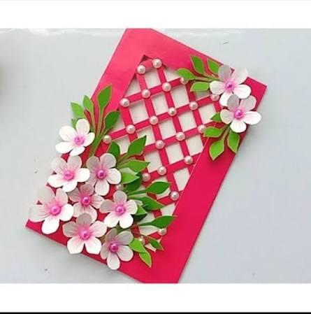
Designing a greeting card is a creative act that requires both artistic and strategic thinking. A beautiful card is the result of dozens of decisions made with clear purpose and genuine care. Every choice, from paper stock to typography to finishing technique, contributes to the final experience. Understanding what to consider at each stage of the design process helps you create cards that resonate. Whether designing for personal occasions or professional distribution, these considerations apply universally. They transform a blank canvas into a meaningful, beautifully crafted communication piece.
Defining the Purpose and Audience Before Designing
The most important design decisions are made before a single creative element is chosen. Defining the card’s purpose and intended recipient establishes the creative foundation for everything else. A birthday card for a close friend has different requirements than a corporate holiday card. A sympathy card demands different design sensibilities than a wedding congratulations card. Understanding the occasion, the relationship, and the emotional message guides every subsequent design decision. Starting with clear purpose prevents design choices that look beautiful but feel contextually wrong.
Audience Demographics and Design Language
The intended recipient’s age, personality, and aesthetic preferences significantly shape appropriate design choices. Children delight in bright, playful colors, expressive illustration, and energetic typographic choices. Young adults often respond to contemporary design trends, bold graphic approaches, and cultural references. Mature recipients may appreciate timeless, elegant design with restrained color palettes and classic typography. Professional recipients expect design that aligns with formal business aesthetic norms and brand standards. Designing with the specific recipient in mind produces cards that feel genuinely personal rather than generic. This audience-centered approach is the most powerful personalization tool available to any card designer.
Defining the Emotional Tone of the Card
Every greeting card communicates an emotional tone before any words are read. Color, imagery, typography, and layout collectively establish this tone for the recipient. A card intended to celebrate should feel joyful, vibrant, and energetically warm. A card intended to comfort should feel calm, gentle, and quietly supportive. A card expressing love should feel intimate, warm, and visually soft. A card recognizing professional achievement should feel polished, confident, and respectfully elegant. Defining the desired emotional tone before designing ensures all creative choices work together coherently.
Color Theory and Its Application in Card Design
Color is the most emotionally immediate element in any visual design, including greeting cards. Color choices establish mood, direct attention, and communicate personality before anything else is processed. Warm colors like red, orange, and gold energize and celebrate. Cool colors like blue, sage, and lavender calm and reflect. Neutral palettes of cream, ivory, and grey communicate sophistication and timeless elegance. Understanding basic color theory empowers you to make deliberate, emotionally effective color choices. A color palette built with intention creates a more emotionally resonant card than one assembled by chance.
Creating Harmony Through Limited Color Palettes
A common design mistake is using too many colors and creating visual chaos. Cards with limited color palettes of two to three colors typically feel more elegant and cohesive. A primary color establishes the card’s dominant emotional character and visual energy. A secondary color provides contrast and supporting visual interest without competing for attention. An accent color, used sparingly, creates moments of visual delight and surprise within the composition. Limiting the palette forces creative discipline and produces more visually unified results. The most memorable greeting card designs are often those built on a simple, harmonious color foundation.
Typography Choices That Set the Card’s Character
Typography communicates personality, emotion, and brand identity in every written element of a card. The font you choose for a card’s headline establishes its entire visual character immediately. A flowing calligraphy script communicates romance, warmth, and personal intimacy. A bold, geometric sans-serif communicates confidence, modernity, and contemporary design energy. A classic serif communicates tradition, reliability, and distinguished elegance. A handwritten font communicates authenticity, informality, and genuine personal investment in the message. Choosing typography that aligns with the card’s emotional purpose creates a seamless communication experience.
Typography Legibility and Hierarchy
Beautiful typography that cannot be easily read fails its primary communicative function. Legibility must be a primary consideration alongside aesthetic appeal and emotional tone. Body copy inside a card should be set in a clean, readable font at a comfortable size. Headlines and key phrases can use more expressive, decorative typography where legibility remains acceptable. A clear typographic hierarchy guides the reader’s eye from the most important to the least important elements. Size, weight, color, and placement all contribute to establishing an effective typographic hierarchy. Well-executed typographic hierarchy makes a card feel organized, intentional, and professionally designed.
Imagery and Illustration in Greeting Card Design
The imagery style chosen for a greeting card defines its aesthetic identity and emotional register. Photographic imagery creates realism, personal connection, and documentary authenticity. Hand-drawn illustration creates warmth, artisanal character, and unique visual personality. Vector illustration creates clean, bold visual energy and works well at any scale. Abstract art creates interpretive freedom and emotional ambiguity that can be deeply personal. Watercolor and painterly styles create softness, romance, and a beautifully imperfect human quality. The right imagery choice depends on the card’s emotional purpose and the recipient’s known aesthetic preferences.
At the stage where design decisions transition to production decisions, choosing the right print partner becomes critical. Professionals offering custom greeting cards printing bring technical expertise that ensures your design vision is fully realized in print. They advise on paper stock, color profiles, bleed settings, and finishing techniques from a production perspective. Their guidance prevents common design-to-print translation issues that undermine the final card’s quality.
Working With Bleeds, Margins, and Safe Zones
Technical print specifications are as important as creative design decisions in card production. Bleed areas extend the design beyond the final trim line to prevent white edges after cutting. Safe zones keep important design elements away from the trim line to avoid accidental cropping. Margins ensure text and key visual elements are not positioned too close to any edge. Understanding and correctly applying these specifications prevents costly reprinting due to technical errors. Most professional print providers supply templates that make bleed and margin setup straightforward. Using these templates from the beginning of the design process saves significant time and frustration.
Paper and Finish Selection in Card Design
Paper and finish decisions are made alongside creative design decisions, not after them. The paper stock affects how colors appear, how textures feel, and how durable the finished card will be. Matte paper absorbs light and creates a soft, non-reflective surface with a sophisticated quality. Gloss paper reflects light and creates vivid, high-impact color reproduction with visual energy. Textured paper adds tactile interest and a sense of craft and artisanal production. Each paper type interacts differently with inks and printing techniques, affecting the final appearance significantly. Designing with your chosen paper stock in mind produces better design decisions and more cohesive final results.
Reviewing and Proofing Before Printing
The final stage of the design process, before production begins, is thorough proofing and review. A digital proof allows you to review layout, color, and typographic elements before ink touches paper. A physical print proof allows you to evaluate color accuracy, paper feel, and finishing quality in hand. Both proofing stages should be completed carefully with fresh eyes and ideally with a second reviewer. Common proofing errors include overlooking typos, missing brand elements, and color profile mismatches. Catching these errors before full production prevents expensive reprints and delays. Thorough proofing is the final quality assurance step that protects your design investment and ensures excellent final results.

 English
 French
 Spanish
 Portuguese
 Deutsch
 Turkish
 Dutch
 Italiano
 Russian
 Romaian
 Portuguese (Brazil)
 Greek